


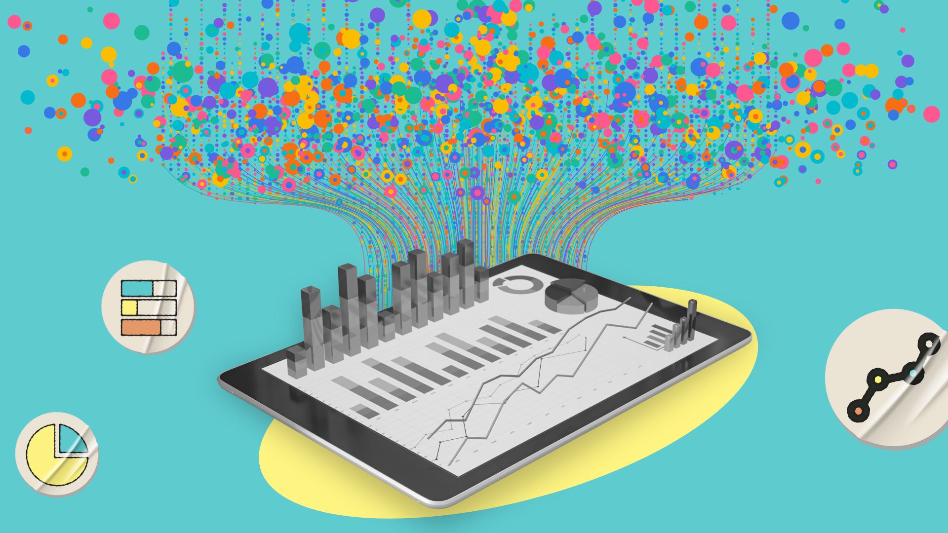
Any data is deadly boring without a compelling story.
Suppose you have a list of countries, their respective per capita income, and the average years a person in that country is expected to live. It will be a long table of names and numbers which you can arrange in ascending or descending order of values to see which countries have high per capita income and in what parts of the world people live longer. Though it is very likely that you will be curious to know if people in rich countries live longer, you will find it bafflingly difficult to find out just by looking at the table. You have all the necessary information, all the data right there in front of you and yet, you cannot know. In other words, data does not translate into a compelling story. One of the ways to see the story behind the data is to picture it, a process that geeks call data visualization.
Suppose I make a graph with per capita income on the horizontal axis and life expectancy on the vertical axis. In that case, each country can essentially be represented as a dot according to the respective combination of values of these indicators. Full disclosure. This is precisely what the renowned statistician Hans Rosling did in one of the most watched presentations of all time when he showed to a wide-eyed audience that countries with higher per capita income have higher life expectancy.
The general usefulness of visualizing data for digesting a vast amount of information may seem mostly common sense to you by now. But, you may feel the urge to ask what is its use beyond a technical exercise of converting data from a tabular to pictorial format. More specifically, what is the role of data viz for common folks as citizens? That is the main concern of this article, to which I turn now.
Data Visualization as a tool for civic engagement is not new
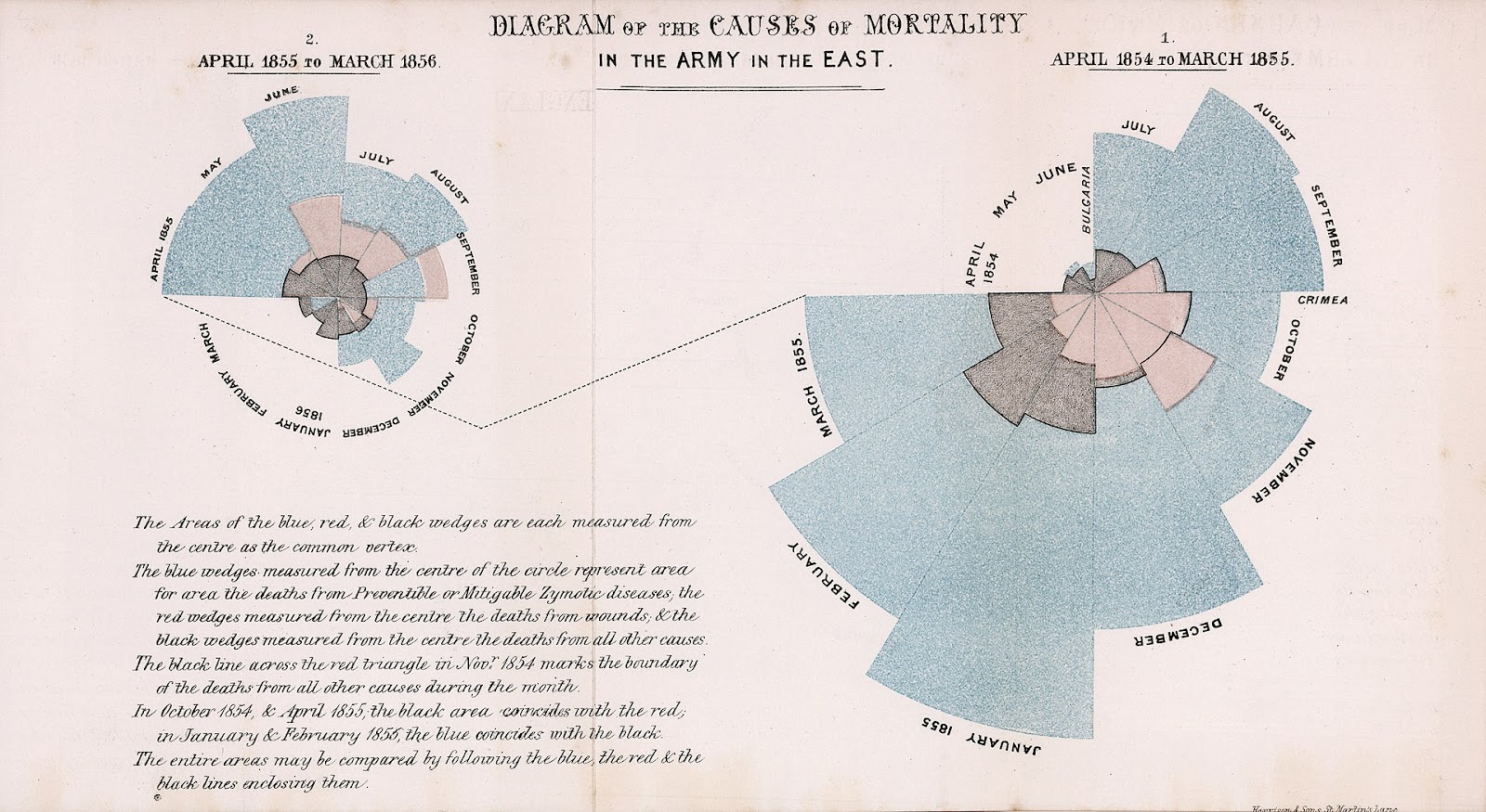
Everyone has heard of Florence Nightingale, the lady with the lamp. She is well known for her selfless service during the Crimean War in the 1850s and as the founder of modern nursing. But what is rarely known is that she was also a pioneer in data visualization and using that as a powerful tool of advocacy. She made a series of polar area diagrams, which we now know as Nightingale Rose Diagrams, and compared the death rates of civilians and soldiers in the army barracks. Those diagrams revealed that more soldiers were dying from preventable diseases than from battle wounds, and swayed the public opinion in favour of spending money on healthcare facilities rather than ammunition.

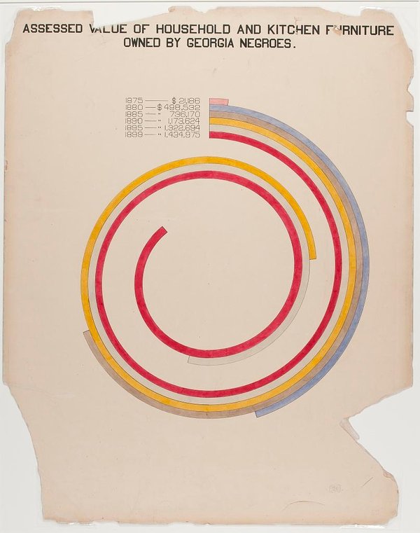
Few decades later, at the first Pan-African Conference in 1900, the preeminent anti-colonial thinker and sociologist W.E.B Du Bois showcased what appeared to be standard statistical data. However, it was his innovative conversion of these statistics into captivating, hand-drawn visuals that set his work apart. The use of statistics, let alone charts and graphs, for talking about racial disparities and colonial history was groundbreaking at the time. Du Bois firmly believed that if people can see the bare facts, they will get convinced and their perceptions will be transformed.

These historical examples underscore the potential of data visualization not just as a tool for understanding data, but also as a means of civic engagement and active citizenship. By making data more accessible and engaging, data visualization can empower citizens to participate more effectively in decision-making processes. But, even if the power of data visualization is undeniable. It can make complex information accessible and understandable to all. But like any tool, it requires us to be careful in real-world applications so that we do not end up doing more harm than good. Just as words can be used to enlighten or deceive, data visualizations can also be used to clarify or obfuscate, to inform or mislead.

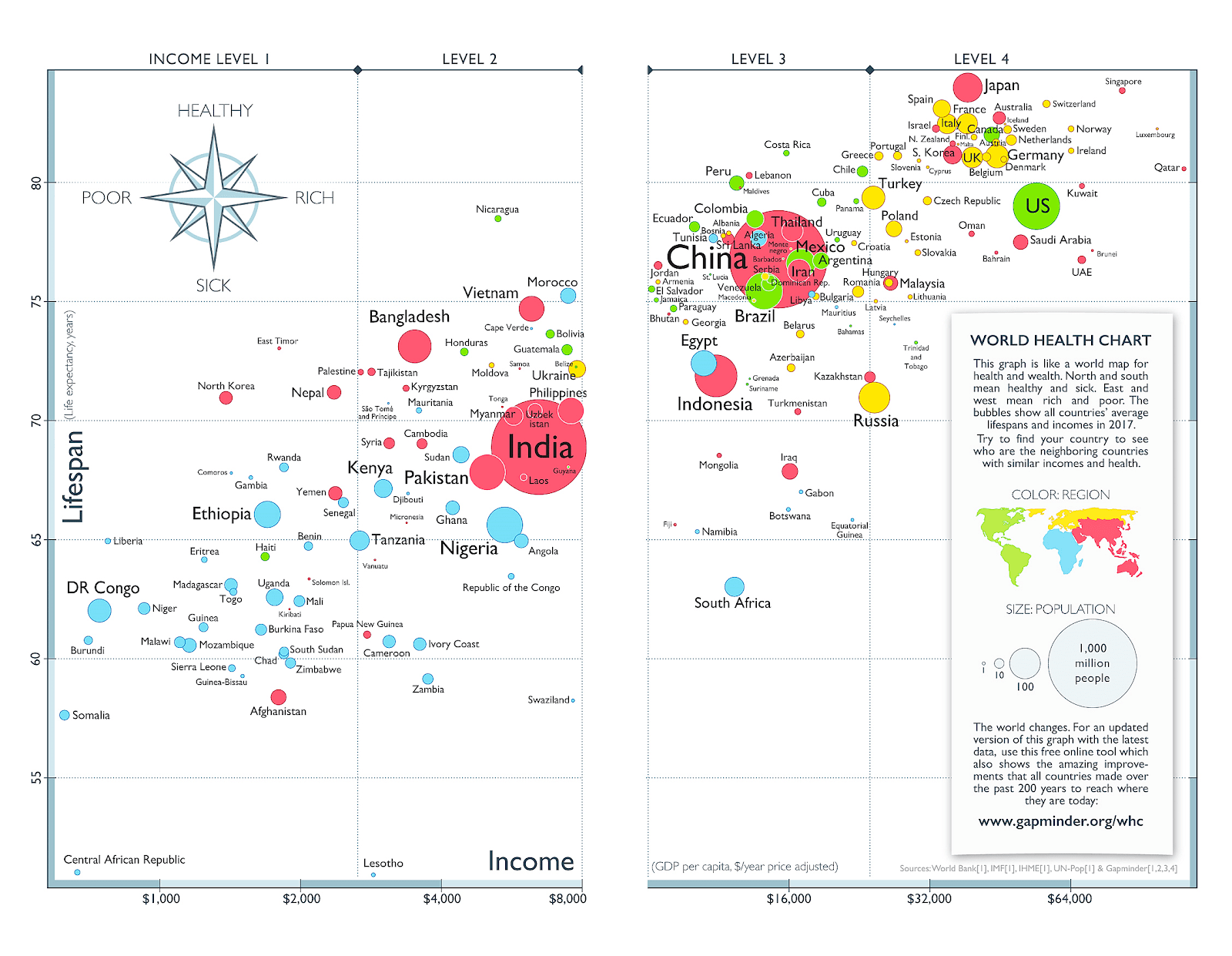
We can return to Hans Rosling to make a case for this. Hans Rosling’s captivating presentations have done much to highlight the progress humanity has made. Yet from a critical perspective, his “factually correct” presentations paint a rather rosy picture of global development. Careful selection of what is shown and what is not shown in those graphs bring insufficient attention to persistent disparities and inequalities.
Data visualizations are almost always based on quantifiable metrics, and might miss the depth of personal experiences, social intricacies, or personal well-being. This can lead us to overlook deep-rooted issues. Thus, the structural nature of many of our problems may often get ignored while we wonder over the visually appealing narrative.
How not to create bad visualizations
I should clarify here that talking about avoiding bad or terrible charts is different from talking about how to make good or great charts. It is only the former that is the concern here. Despite certain constraints, data visualization can be a powerful tool to foster civic participation and amplify democratic discourse. To begin, we identify the key elements and relationships that are relevant to our objectives. Then, we gather measurable data about these elements, regardless of whether it’s numerical or textual. Armed with this information, we can proceed. For the data visualization to effectively engage citizens, we should keep in mind five critical factors:
Choice of data
Before visualizing information, it’s essential to assess the data quality and relevance. For example, if we want to show whether there are gender-based differences in voting participation in a particular area, we should have a properly sampled gender-disaggregated data on how people voted in the previous election or elections, without an over- or under-representation of any gender group. To the extent it is possible, we may also want to look more deeply into how the particular data was collected. For example, in the case of publicly available survey and census data, it is important to note what questions respondents were asked, what sampling design was chosen, and whether any sort of weighting is required for making the data more representative of the population.
Choice of type of chart
Even when they draw from the same data, not all visualizations would be equally effective in telling the intended story. Some would make more sense in a particular case than others. Developing a knack for choosing the right type of chart requires familiarity and practice with different formats. Still, some thumb rules can be adhered to. For example, line charts, which might be the first thing that comes to your mind when you hear the phrase ‘stock market’, are appropriate for showing continuous trends over a continuous variable such as time.

Similarly, bar graphs are good for comparison across categories. In bar graphs, as the name suggests, the value for each category is represented by the length of the bar. Some people say that humans are generally good at intuitive comparison of lengths, which partially explains the popularity of bar graphs in visualization of information. Many configurations of bar graphs exist, depending on the orientation of bars (vertical or horizontal), arrangement of categories (stacked or side-by-side), among others.

To take another example, area charts are slightly different from line charts where the area under the line is filled or shaded. When the purpose of visualization is to show comparison along with evolution of something, a stacked area graph can be the perfect choice.

With the community of data visualization growing, imaginative ways of presenting data points and their relationship are growing too. Today, it has no longer remained challenging to learn about different types of charts and what their suitable usages would be. You can start exploring the vast catalogue of chart types here, here, or here.
Choice of informative elements
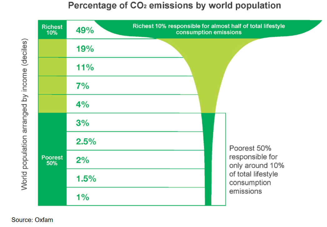
There should be no element in the final visualization that is unnecessary for the intended story. Clarity is non-negotiable for effective communication and should never be compromised. For example, a graph that requires legends must have legend with clear enough text and placed outside of the plot area where it can easily guide the viewer. Axis labels should clearly denote what is measured on that axis. A very good example of a very popular but improper infographic is the Oxfam chart on carbon emission inequality is discussed in Noah Smith’s blog. Looking closely at the Oxfam funnel chart, it seems to overlook basic details like axis labels, scale, and a legend. Noah notes that the chart’s title is misleading because it actually shows “total lifestyle consumption emissions” instead of just CO2 emissions, but it doesn’t explain this. Also, having a scale would have been helpful to understand the exact emission amounts, and not showing the actual data points makes it less informative.

As the example illustrates, any technical terms or jargon should be kept to a minimum and explained to the degree possible within the chart. Needless to say that care should be taken to select the type of information according to the literacy and education levels of its intended user to keep it accordingly accessible.
Choice of aesthetic elements
Aesthetics matter. Any design choices should be based on two ethical considerations- it should be clever but must not deceive. A clever choice of aesthetic elements can attract more attention of viewers, which is a main purpose of doing visualization in the first place. Yet, it’s easy to err with misleading colours or fonts, which must be avoided, especially in advocacy. That should be sincerely avoided in advocacy and engagement activities. For example, let’s refer again to the Oxfam funnel chart and see how different shades of green are used without any purpose or specification. Sometimes these choices are based on the brand design guidelines of the publisher. Yet, decisions about colour palette within the graph should rest with the person creating the chart to avoid any misleading impacts.
Choice of narrative
There can be many ways to represent the data visually to tell a particular story that interests the storyteller. There will be as many possible ways in which the narrative can mislead. This makes the narrative choices the most difficult of all the choices listed here. The only general rule that can be set here is that the visualization should be as much “perfect” as possible to reduce the gap between what was the intended message and what message the viewer receives solely by looking at the visualization. But, I must add here at the risk of sounding a bit vague that there can be other ways of making this choice, guided by both the values of the storyteller and the context-specific requirements. For example, a less controlled approach would be to make visualization open and inviting. In the end, it should allow the citizens an opportunity to more critically engage with the information and come to more nuanced rather than simplistic conclusions.
It may seem that these considerations restrict our choices in creating effective data visualization but that is not the case. There are at least 100 ways to visualize even the simplest dataset, as this recent project shows. It is a world of unending possibilities and we have barely begun to use it for effective communication of information in spaces of civic engagement. But, as we embrace data visualization as a tool for civic engagement and active citizenship, we must also foster a critical literacy of data visualization. We must learn not only how to create and read data visualizations, but also how to question them, to understand their limitations, and to consider what they might leave out.